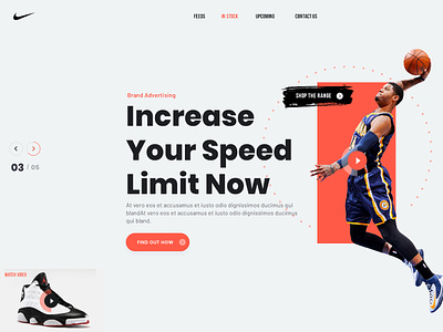
Nike Website Mockup
Nike is a global giant and their marketing should only be top-notch.
Banking on the factor of intense physical activity in sports, the orange color is used with the minimalistic white color.
This rethinking of their website compacts the elements with the use of hyperlinks for redirections to sub-pages. This is in contrast with the seemingly endless scrolling of their current page.
More by Jackson Yew View profile
Like
