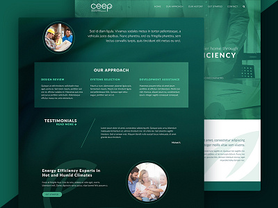
Home Energy Company Homepage
I had fun with a two-color brand palette while designing this home energy company's site mockup. This was created before most of the homepage copy was written, which is unconventional, but this also allowed me to show how their brand elements would come together online.
More by Marionne Patel View profile
Like
