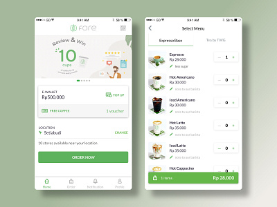
Fore Coffee-Order Flow Redesign
Purpose:
To make the order flow more simple.
Focus:
Landing Page & order flow.
Solution:
1. Landing Page
- Resize the texts for better visibility.
- Still with Fore Coffee colorguide, I recoloured this design with bolder colours to highlight the important things, such as: make user aware that Fore has Free Coffee Promo, etc.
- Remove ‘Pick Up’ and ‘Delivery’ buttons. User can choose it later.
- Simplified the navigation menus from 5 to 4.
- By putting location before order, the app will inform user if there’s any available Fore Coffee store near their location.
2. Rearrange order flow interaction.
- In drink selection list, I removed banner, Delivery & Pick Up buttons, so user can focus on list thumbnails.
- Adding note field for barista. Example: “I want less sugar”
- Removed Free Coffee promo if user use regular order.
All problems and solutions are based on my personal hypothesis.
