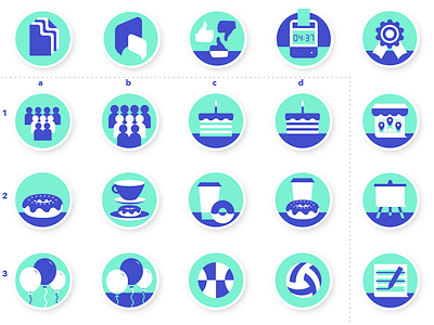
Social&Community badge design
I had to squeeze in another badge design this week. The top and right side badges are the ones previously made and approved. The rest are different options for the new topic Social & Community.
The main struggle was to maintain the same style as the previous ones. The gap between those and the new one is 2-3 weeks and it's amazing how deeply a different moment in time can influence your design. Some of the new ones express too much depth and volume. There is a certain level of flatness and line fluidity that I was able to maintain throughout the previous ones. Finding that balance again was a challenge. The bagel for example is somewhat foreign in this context. And so is the crowd of people. What I thought it's gonna be a quick and dirty job ended up taking a whole day: from first drafts, send in for feedback to design team and marketing department, to discussions over which is appropriate for a workplace app, for our brand, to finesse the final design and place it in the Assets Coffer. For reference, all the other ones also took a day.


