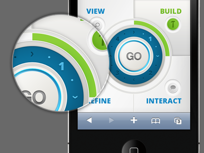
Navigation Draft Layout 2
Here is a revision of the previous navigation layout (http://dribbble.com/shots/617952-Navigation-Draft-Layout) After many discussions, the client finally agreed the home screen was too cluttered so I needed to take a step back to redesign it with the same basic layout in mind. Not sure how I feel about the green vs. the red I used previously.
More by Chris Ota View profile
Like
