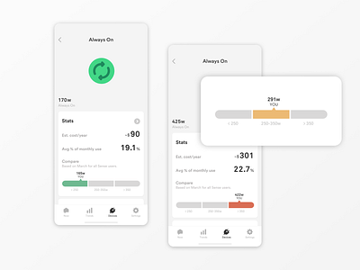
Sense compare widget
The Always On view now contains a new 'Stats' card featuring a new comparison widget, showing users how their always on compares to that of other Sense users.
This UI element has gone through many iterations. We ultimately decided on keeping it simple by using 3 buckets (low, medium, high), using the color to give users a quick glanceable reference point.
We plan on using this in other places within the app soon!
More by Sense View profile
Like

