F Icon
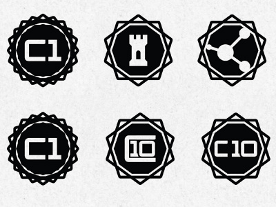
Branding summer camp. The two bottom right icons are for cabins. Trying to determine which version works better. Ten cabins so i started with the number that will take up the most space. Version on the left was done to try and keep the amount of space relatively the same for cabin to cabin.
More by Doc Reed View profile
Like
