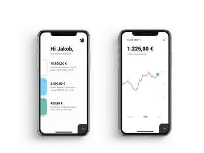
Tomorrow 2.0 - Navigation
Some of our early design concepts for the new Tomorrow banking app: We thought a lot about simplifying the overall banking experience, reducing cognitive load and creating a friendly voice. We also thought about different thumb-focused navigation patterns as an alternative to the tab bar.
1 week later we tested this version with customers and figured out that the common tab bar is still a better navigation. Back to the sketching board!
More by Stan Reimgen View profile
Like
