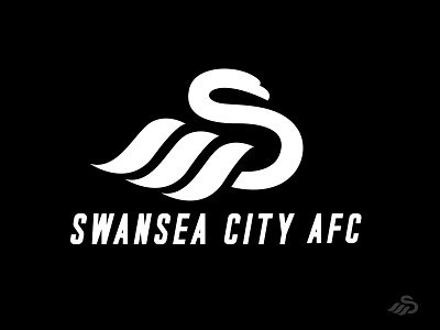
SWANSEA CITY AFC.
I had to give it a go to Swansea City AFC logo. I liked the idea they had but I really didn't like the Swan and the wordmark placement . My input was to make that "S" more prominent and clean and have the feathers a bit more wavy (sea/waves). At the end i added the boldness as I believed that it was necessary. .
.
More elements can be found in the attachment below .Also let me know what you think! 😊👍
.
NOTE* NOTE AN OFFCIAL REBRAND OF THE SWANSEA CITY AFC. *
.
Contact:
ltdesignsss@gmail.com
Follow me.
More by Lia Tanasa View profile
Like

