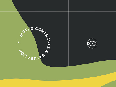
Muted Saturation Identity
Brand identity and web design for Muted Contrasts & Saturation.
Muted Contrasts & Saturation is a platform for students and active youth to talk about sustainability and climate change. The younger generation is getting more active, therefore this platform lets them share their opinions, write articles and meet similar minded people.
The purpose of the project was to create a visual language that would talk with youth generations in inspiring, cozy and non-formal way. Design creation was a core of the project and it was important to make it attractive and raise the interest and enthusiasm for the users.
Full project:
https://www.behance.net/gallery/78300209/MC-S-Identity
More by Outer Studio View profile
Like
