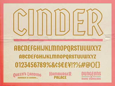
Cinder Typeface

Gosh, it's been too long since I've last posted, but I'm excited to share a family that's been in the hopper and now finally out in the wild.
After rewatching Cinderella with my daughter a few years back, I feel in love with the lettering styles in the title and credit cards found in it and many of the animations from the 50s. Much of the lettering gravitated towards a blackletter style that I felt was missing in today's design-scape. As I began to create the family I looked at some ways to adapt the style to a modern context and throw some magic in the mix with opentype features, alignment, and alternates. This family goes for small caps in the lowercase, but they often felt like their own style to me, so I built out small cap forms for the numbers and symbols also.
You can check out the full family over on the Fort site.