Software Development company logo
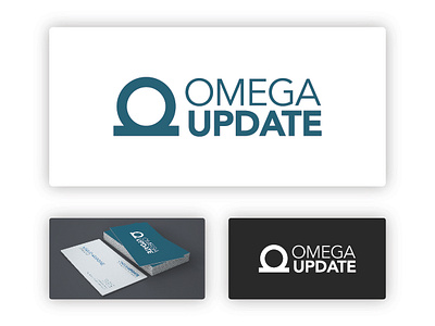


The circle represents how the company’s applications unites all the files, archives, staff, merchandise, invoices, ... in one place (software) for their clients.
The Bar under the circle is like a base where the circle stands what means the software/app is also a database.
The circle represents a letter O as well and the overall mark is an Omega, with connected legs to show how the software works on a network and on several computers at once.
The color is a blue-greenish to convey trust and development & growth.