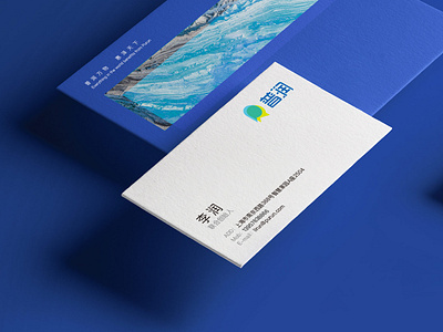
Purun Business Card Design
The Purun logo is positioned in a modern and fashionable style. This is the same from the positioning of the graphics. It simplifies the processing of the initial letters P and R, and makes a clever connection to form a perfect form of P and R. The youthful and energetic blue and yellow blend into the figure, colliding with the third color green. The most primitive three primary colors between the heavens and the earth represent the characteristics of Purun real estate as a natural product, containing a kind of financial and real estate enterprise attributes, which reflect the company's The corporate philosophy, that is, "Purun all things to benefit the world."
More by Xinyu View profile
Like
