Promo Website Animation for Bamboo Charcoal Sponge
Sup buddies?
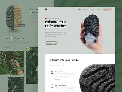
Have you seen @Sasha Turischev new promo website design? Well, I'd say that's pretty cool, and my objective was to make it even better by adding some life into it. What you see above is the animated version of a website promoting a sophisticated 100% all-natural and biodegradable sponge. The product’s mission is to promote self-health and mindfulness, changing our shower experience for the better. In simple words, it means reminding ourselves to slow the hell dow and that taking some time for ourselves is more than okay. We’re completely on the same wavelength with this. The guys paid great attention to the branding, design and promotion of their product, the only thing that lacks is a top-notch website.
Join our Newsletter for more inspiration!
Goals Creating a clean and minimalist website to match the product’s nature and style, presenting all its advantages and benefits to the world.
Approach To connect the brand with the target audience, we tried to find the most appropriate solutions to do that. To this end, we chose to use pastel-green color palette and demi bold typography to make the website look clean and feel relaxing. We also used floral patterns to make it look closer to nature.
Results We ended up with a neat, simple and a bit experimental website design that adheres to the product’s style and originality and speaks to the target audience. This is only the first version though, so share your feedback and let me know what you think of it!
Press "L" to show some love!
ᗈ Join our Newsletter! ᗈ Website ᗈ TheGrid ᗈ Spotify ᗈ Twitter ᗈ Medium ᗈ Facebook ᗈ Instagram
