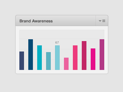
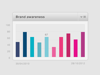
Rebound: Interactive Bar Chart
On Rich's recent shot, he mentioned that he's looking to the Dribbble community to help him improve as a designer. I love that attitude, so I wanted to show how I would approach some of the final polish. I really liked his overall vibe, but I felt a few tiny details could be tightened up. There's obviously a million aways to approach and build this stuff and it all comes down to personal taste, but here's what I'd suggest:
Try to be as subtle as possible when it comes to gradients. I toned down the grey gradient (aka greydient) in the top bar. Same approach applied to that divider in the top bar.
Similar to the subtle gradient, I tend to approach highlights the same way. I want them to be there but not really noticeable. I also keep the angle at 90°.
I'd try to keep text shadows as "crisp" as possible.

