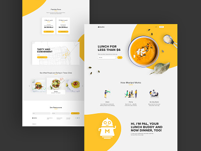
MealPal — Landing page redesign
For my Daily UI challenge #3, I decided to redesign MealPal's current landing page, which looks a bit outdated from UX/UI perspectives. For those who don't know, MealPal is a monthly lunch subscription service.
Upon my research I noticed that on their website they are using red along with two different shades of blue. Since, blue is associated with appetite suppression and because this is a food/lunch service website, I thought it would be a good idea to recreate a new and more appetizing color palette with bright orange/yellow being the primary and dominant color in the layout and dark gray as a secondary.
I also made some changes to their user experience design by rearranging some elements of their current landing page.
Here is the link to MealPal's website:
https://mealpal.com/
Let me know what you think, any feedback is welcomed. Thanks!


