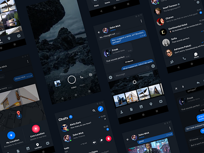
Telegram Messenger for Android – Dark mode
The winner of the Telegram's design competition in March '19.
Complete UI reworked from scratch.
Major UX changes:
– Rarely used "New message" button moved to the top
– Typing notification appeared on the bottom navigation bar
– Number of messages now shows near the chat title
– Rethought calls feature, now it's right on the chats screen
– File attachments simplified to a single button
Check out real pixels in the attachments.
More by Ian Rakeda View profile
Like

