Chase
Full layout: http://cl.ly/681f69d6bf70
Just something I threw together in my free time. I thought the initial application was missing a bit of personality.
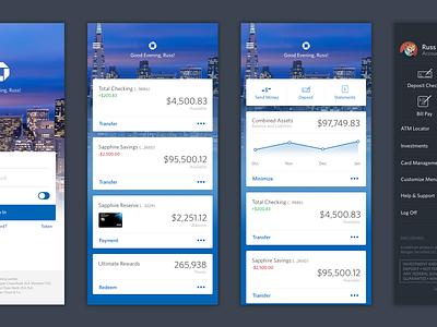
The menu's on the current application need a lot of work for example; there are 5 different options to make a "transfer." My solution is to have a single button that says transfer or send money and by going through a select flow, the application will understand if it'll be an inter-account transfer, a wire transfer, or a Zelle transfer.
On the third screen, I have 3 icons laid out - the first two icons are in my opinion very important and frequent functions.
• Sending money, people always send money to friends/family that need access to funds almost immediately. Again, this button would go through the transfer flow to understand how the money will be sent.
• Deposits: The majority of customers still receive checks and spend 45 or so minutes a month walking it down to the bank or ATM to make a deposit. Checks are still alive and well, and not only do you still keep the check after, the entire process takes less than 5 minutes.
• Statements: Not going to lie, threw this in because I couldn't think of another frequent action and having two buttons didn't make sense. This can be changed from the menu>customize menu option with other things.
The combined assets box is just a neat little thing I threw in because it's interesting to see how much credit & debt you have. There would be an option to link other financial accounts, to show a bigger balance and help the customer get a better understanding of their combined balances. Internally, this would help bankers get a better picture of the customers financial status and tailor better products for them.
All in all, fun little project. Thanks for checking it out!
