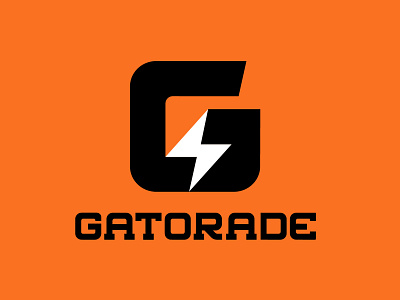
Design Challenge: Gatorade Rebranding
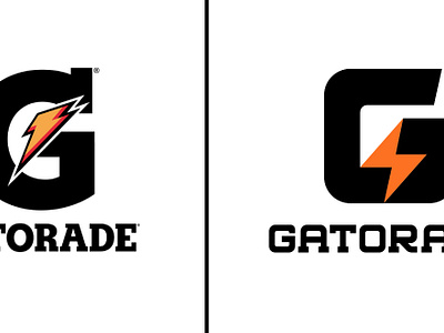
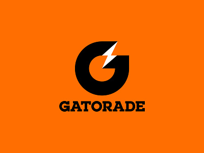
After seeing @Allan Peters Gatorade rebrand and noticing how many designers in the community wanted to take a stab at their own version, I knew wanted to throw my hat in the ring too! It's kind of become an unofficial design challenge which is rad. How many different ways can you make a "G" and a lightning bolt work together?
I started by creating custom type similar to what Gatorade already has established with bold slab serifs but I also wanted the word mark to have a more modern sports vibe. I worked with my letterforms negative space and tried to create a new mark that not only remains legible, but represent the brands sporty attitude moving forward into the future of sports marketing. Let me know what you think and thanks again @Allan Peters for the inspiration.
•
Let's work together!
www.cbcoombsvisual.com


