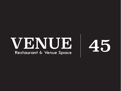
Venue 45 | Logo
I created this logo for Venue Properties' new high-end restaurant/venue space, Venue 45. The owner placed the 45 in the name of the company to pay homage to the location by pulling it from the address number. The business is located in the heart of the owners' home town a newly restored Victorian-era building. The name is also meant to be modular, with the intent of opening up other locations keeping the Venue and replacing address number with something specific to that location.
This brand strategy called for a mark that expressed the class of the original era of the location's building with a modern touch like the renovations done to it. To do this, I used a serif font to pull in the more classic feeling and then toned down the curves and paired it with a more modern sans serif font for the secondary text. The logo also needed to allow for the idea of a modular name without breaking away from the overall look of the brand. I used a fine separation line that would allow for future titles that may get too long to be stacked or sized differently without disrupting the main text of the logo.
I wanted to give a special thank you to Andrew Herndon for creating the awesome font Atami that was used for the supporting text. undeamazinhttps://www.behance.net/gallery/34020116/Atami-Free-Typeface
