Prime Typography

See the full post over at the 63 Visual Instagram
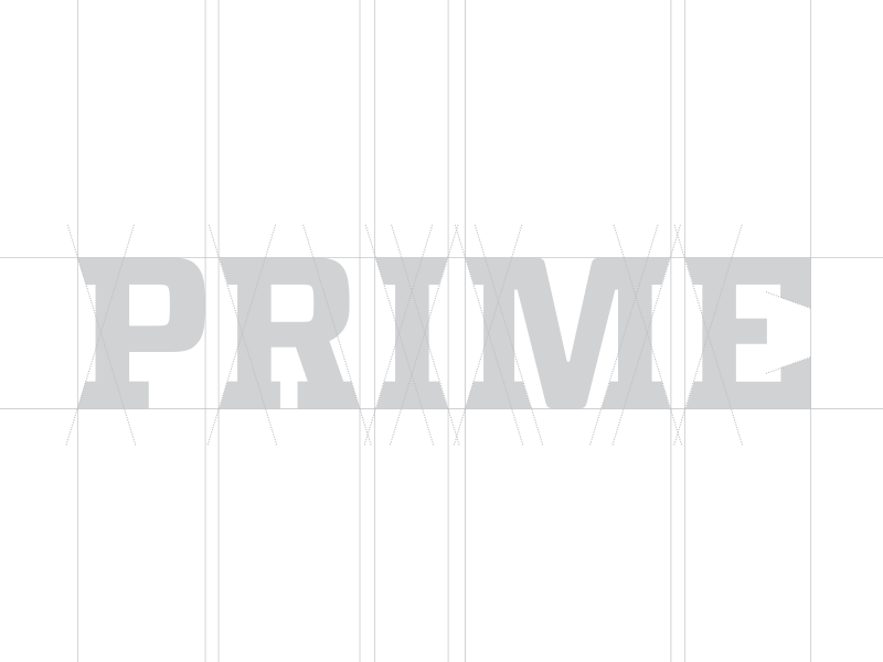
A great brand identity does not need to be complex. There are times when a client is looking for that unicorn of a logo, or an “I’ll know it when I see it” epiphany moment when the legendary logo appears. However the fact is that great global brand identities are not overly complicated or illustrative. They need to be strategic, unique and legible and over time become a well known identifier that is tied to the brand personality and operational qualities of a company. This custom logotype and brand identity system for Prime Roofing does just that. By embodying the brand attributes of the company such as solidarity, toughness, boldness and professionalism the logo gives the opportunity to communicate these ideas to the clientele. Creative director Patrick Carter states, “I’ll never forget watching an @aigajax presentation where legendary icon Michael Beirut stated that typeface selection is often the foremost consideration when approaching a brand identity project. That has stuck with me over the years, and I think this project shows that a customized typeface that strategically positions a brand around its key identifying qualities makes for an effective brand presentation.”
