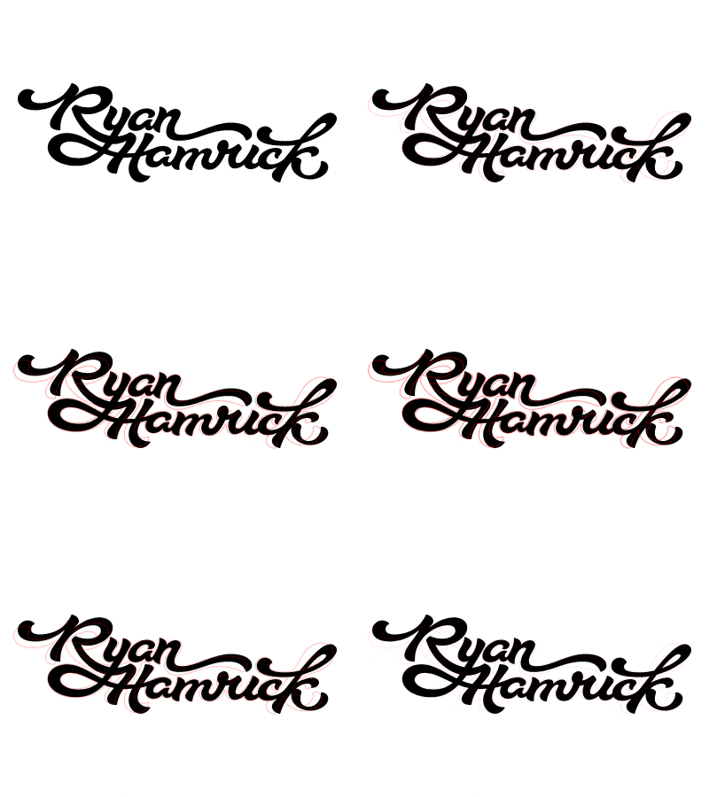
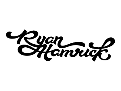
Sig Comparison
Thanks for the awesome feedback, all!
Here's the new version with a comparison overlay from the last one in a red stroke (big version attached again, with comparison, also)…we'll just say I changed a few things. :)
More by Ryan Hamrick View profile
Like


