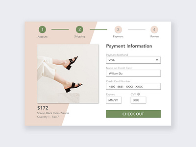
UI design challenge-checkout page
How to increase the conversion rate, i.e. get users to finish the payment process, is the main challenge for every checkout page. I tackle this challenge by creating a simplified checkout process with all the necessary information for users to make a purchase, such as price, material, and size. More importantly, according to academic researches, green CTA button triggers a double conversion rate than any other colors.
More by Shantelle Liu View profile
Like
