Transit App - Route Selection Screen Redesign
52 Week Challenge.
—
Each week I will redesign one (1) screen from an app that I use on a daily basis. The goal is to enhance the user experience and improve the overall aesthetic of the screen.
Week 3: RocketMan Transit App - Route Selection Screen.
—
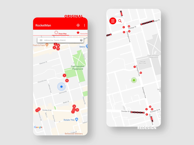
I use this app practically every time I leave the house, so this reimagining is more of my own wish list... Being an extreme user, meaning that I use this app with a very specific goal in mind—to find out when the next transit vehicle will be at a specific stop—I made some simplifications to the main screen. I always found the search bar somewhat superfluous, mainly because I personally never use it. (If I wasn't sure where I was going, I'd use Google) My solution is to simplify and clean up the top part of the original app by migrating all the extras into the apps menu, while still providing the user with a way to search, if there ever was a need to.
My other main issue with the app is that once you select a route/stop, the app takes you to a new screen where you see a list of upcoming vehicles and their arrival time. This, by the way, takes 2 clicks! My solution is simple; once a user clicks on a desired stop, a card rolls up from the bottom of the screen with route details and a list of upcoming vehicles, which could be pulled up higher to reveal even more vehicles and their arrival times. Swipe down to hide the card. Easy?!?
And, as an extra way to delight, I've taken a cue from ride sharing apps like Uber and Lyft, and displayed real time locations of TTC vehicles. This further helps you plan your trip by being able to see where the vehicles are in relation to your current location.
What do you think??
—
Show some love! Press "L".
Follow and stay tuned for Week 4.
