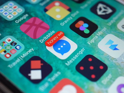
Notification Badge Demo
This is an attempt to explore my last concept a bit more.
The main concept is to replace a number counter with a mindful sentence in a notification badge on an app icon.
There was a couple of concerns:
1. Can we display a user name with a message?
2. Is it legible to read?
3. What defines which sentence should be shown?
1. Display user names
It was a good idea at first glance to show a user name with a sentence. It would allow us to distinguish messages from different users. But unfortunately, we have strong space constraints that are coming from the notification badge size. I can imagine that it works well for short names like mine, but what if your friend Anastasia or Alexander wrote to you? What will happen?
Alternative way I
Also, we could show only user names without messages. It’s much more informative to a user than just numbers. For instance, if you see your wife wrote you something, it’s definitely worth to read.
https://dribbble.com/shots/2585157-Notification
Alternative way II
We could distinguish notification numbers to state their type: 13 likes, 7 comments, 5 retweets or whatever.
2. Readability
Text size in the notification badge is the same as we use for a usual number counter. So, it’s pretty legible size. I had a concern about its legibility when it’s running. Sure it’s challenging to read a running text than static. Letters literally try to run away from your eyes. But in our case when we are going to show only really important messages it’s only better. It works as an accent. Running text attracts more attention to itself than the static one.
3. Importance of notification
Because of constraints, we can use this type of notification only for really important messages. What could that be?
— Messages from a user’s close circle: wife, children, parents, close friends, favorites. They can be set manually with special markers in an app or based on an ML system with analyzing emotional and social weights of each user contacts.
— Emergency notification from a service itself: you got money, someone tried to sign up your account, bills, etc.
Conclusion
1. No place to display user names (but we can show only user names);
2. It’s readable enough;
3. Importance of notification messages is powered by AI.
Examples in the attachment.


