Cognitive Friction
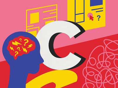
Cognitive friction happens to a user when an interface behaves differently to what is expected. This occurrence impacts user experience negatively and causes product abandonment due to frustration. Users like to stick to what they’re comfortable with, so reduce cognitive friction by keeping conventional ways of completing actions. For example, an “X” symbolises closing a panel, pop up or lightbox. Identify areas of cognitive friction before a product goes into development.
What is an unconventional action in a product/app/website you’ve encountered that frustrates you?
More by Diana Tan View profile
Like

