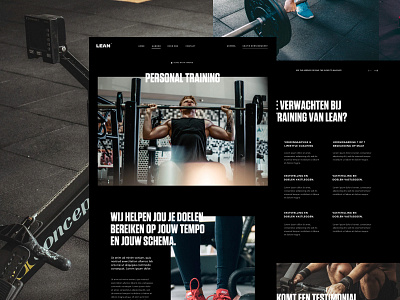
Service Detail Page
'Sup guys
Here you see the detail page of a service of the personal training project i'm working on here at the agency. With this website I wanted to create an easy to navigate website for the user. By removing the clutter the user doesn't need in the main navigation like the contact page for instant, the focus is more on the services. The conversion on this website towards a free intake conversation for the client. Because of the fact that we have this page in the main navigation, we could move the contact link to the footer.
More to come from this project! Let me know what you guys think. You can also find the full view in the attachement.
Have a great day guys, peace ✌
————————————————————
Get a free lesson about whitespace and balance!
https://mailchi.mp/2a1d8a58aff7/freelesson
————————————————————
Want to learn design and animation?
Use the links below for 2 months Skillshare premium for free!
Design class: http://skl.sh/2h4JrWa
Animation class: https://skl.sh/2D8StYQ
Hope you guys enjoy the classes!

