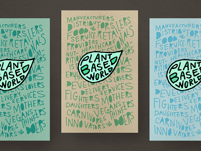
Conference Poster Concept
Another direction for the conference identity I worked on creating last year. This was by far my favorite direction.
I felt passionate about taking the brand somewhere fun and energetic to pull in the widest variety of people to this conference. I wanted to make sure the public knew that this expo was not just for restaurant owners, doctors and businessmen—it was for absolutely everyone.
The hand-drawn / hand-lettered essence of these posters lend to the concept of nature, and act as a visual representation of the relationship between humans and the earth.
Come one, come all.
More by Digital Surgeons View profile
Like
