Ironmonger: Quench Beer Can Design


Quench is a packaging design created for Ironmonger Brewing Company in Marietta, Ga. Additionally, the images display the artist's logo design and digital mock-ups.
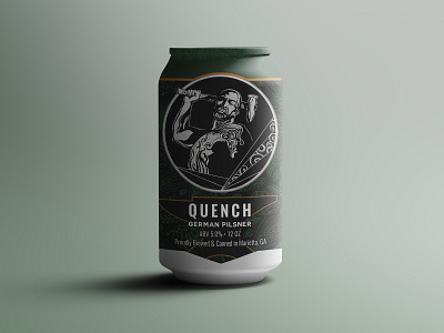
This beer can label features the following notable elements: Ironmonger's hand drawn blacksmith motif, metal accents, and hues of green and gold. The masculine nature of the blacksmith is balanced with the feminine touches of wrought iron scroll work.
Quench is inspired by the ancient art of blacksmithing. In order to communicate this theme to the audience, I began by creating the Ironmonger logo with wrought iron scroll work and old school lettering.
Next, I designed the flagship blacksmith and incorporated the wrought iron details. Behind the blacksmith is a metal texture, and below the blacksmith is the outline of an anvil.
To create a contemporary look, I brought the theme to life using clean lines, muted colors and line art.
There are 5 can designs in this Ironmonger series.