Day 9 - Music Palyer
Hi guys,
Today I was challenged to create a music player.
For this challenge I wanted to create a design for a device I’m not used to design for, like a smartwatch.
To create a simple, clear and easy to use design I used the material design principles and icons.
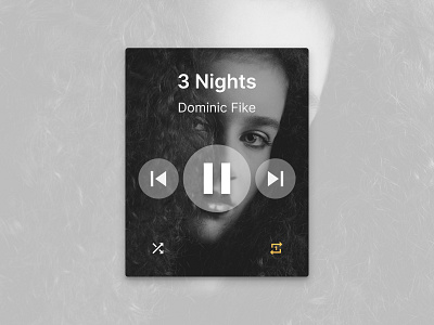
To make the music player visually appealing, I decided to add an image of the artist/album of the song that is currently playing. To ensure that anybody can use the music player at all times, I chose to go with a black and white image. This way the contrast ratio is approximately 16, which means that people who are color blind can use it without a problem as well. I added a pop of yellow to prevent the music player from becoming boring. I made sure to pick a yellow that has a contrast ratio of over 9 so that everybody can use it without a problem, even on a sunny day.
I hope you like it and if you have any feedback, let me know.
Have a great day!
