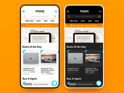
Amazon App Redesign Concept
Hey Dribbblers~ It's been a while! 👋
Last night, I redesigned the Amazon app just for fun because I don't love the current experience.
Please note that some elements were left out on purpose (Notification icon, Shopping List) as in this redesign, I'm the core user and I don't use those features.
Alexa icon has also been changed into a FAB and moved to the lower right side to add visual balance in the navigation bar area while increasing discoverability of the Alexa feature itself. As a bonus, further reducing cognitive load~ 🎉 Also, dark mode for those of us who shops in bed.
What do you think? Press "L" if you like it!🙌
More by David Im View profile
Like
