App design ui ux | Instagram | Buy in app | Service
Hey there!
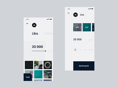
Here we keep on talking about the project Design the application of online service for Instagram
This section animation and application issues are shown in this post. And now we’re describing the exact changes we’ve done in this section.
The main task was to keep the user experience without changes for the launched service in the new application.
This is why we aimed on the functionality and simplicity by decreasing the number of screens uniting them on the main one, where you can get access to any tab with a simple swipe.
In the following post we will demonstrate the transition animation between the sections, so subscribe, it will be fun!
———
Thanks for watching! Let's connect: Behance / Instagram
We're available for new projects! Tell us more at
hello@minomo.studio
