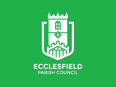
Ecclesfield Parish Council- Revisited
Since the previous post showing the first development of a logo for the council, I have revisited their branding after discussion with the councillor I am working with. We decided that instead the Church should be the main focus of the logo, since it is the centre of the community, and also that the brand should project a more environmentally friendly feel- hence the switch to a green colour scheme.
More by Josh Cope View profile
Like
