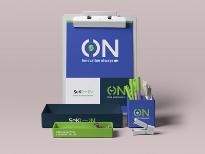
SeKON - Always ON
An impactful yet simple branding for SeKON. As they say now, invest in a logotype rather than a abstract symbol (Uber said it). A conceptual branding that tells more about the company and their ethics and capabilities. Ever sector of the company has their own symbol and tagline attached to the main logo form. Sense of belonging, a positive message that needs not to be deciphered.
Graphic design is not for designers but for normal people to understand, relate, connect and feel proud of. The employees, the team are the ones to build a strong company - they need a consistent message communicated. Thats branding.
More by Dollcee View profile
Like
