Visit Line
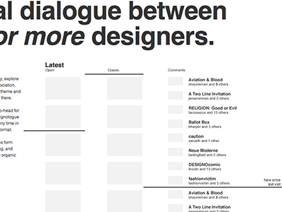
Playing with the idea of a "visit line." On any page with a chronological (or reverse) listing the visit line appears, demarcating new content from the old. Also considering a simple fixed position widget that jumps down to the newest content in chronological listings.
Why did I step back from the previous, big thumbnail design? The new Designologue aesthetic is almost severe in its restraint. Black and white. Zero ornamental fussiness. (A return to form.) It's all about the designologues themselves.
Historically at least 60% of all designologue images (I'm being generous) have been ugly, busy messes. Loading up the homepage with 16-20 LARGE ugly, busy messes doesn't set the desired tone for the site. I might still add some curated content above the Latest section (maybe headed "Greatest," an obvious complement) but I haven't decided how that will be presented or implemented yet.