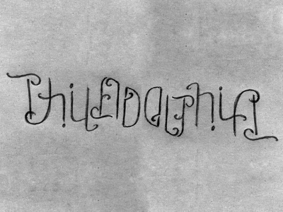
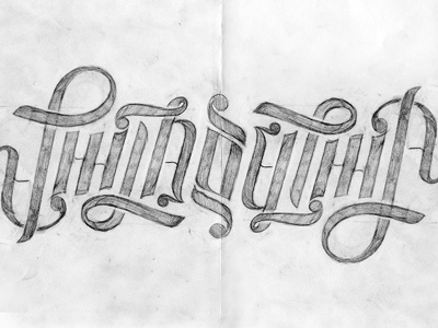
Philadelphia Ambigram
@John Kane Smith lit a fire under my arse with his wonderful rendition of the Philadelphia ambigram, and I wanted to try my own version; not just with with a different typographic aesthetic, but using different lettering combinations as well.
Sketches.jpg - roughs and quick sketches.
Rough1.jpg - a larger version of the shot (my favorite version so far)
Rough2.jpg - a version I drew out giving the letters some weight...and a version which I really don't like. Guess that's what I get for only spending a few minutes on it after I was overly happy that Rough1.jpg was starting to work.
John, I hope you don't mind!
More by Nikita Prokhorov View profile
Like


