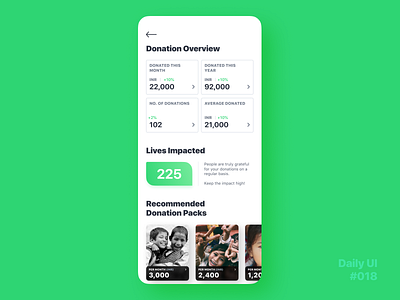
Daily UI Challenge #018 - Analytics Chart
Felt an analytics chart page need not always have shiny bars and lines. How about pure numbers for a change. This is a concept design for an overview page for the user of a donation platform with a subscription service. Allowing the user to donate on a monthly, quarterly or yearly basis – as the user pleases.
Designed on @Figma
Let me know what you think in the comments!🤓
More by Keith Vaz View profile
Like
