Titans Rebrand Passion Project
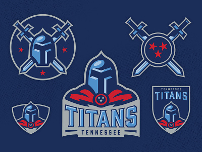
This is my interpretation of a rebrand direction for the NFL franchise, Tennessee Titans.
-
Negative space in the helmet is suppose to create a "T" and the handle of the sword is taken from the top pf the "T" of the font in Titans wordmark (Gin).