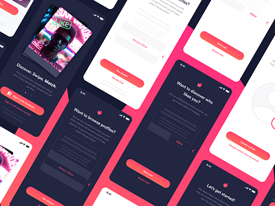
Tinder Onboarding Concept Flow (with Dark Mode)
Tinder recently asked me to pitch a redesign of their onboarding experience. I focused on improving inclusivity by asking users to select their gender identity and sexual preferences up front. I also included a dark mode to improve accessibility too.
I tied the concept together by incorporating Tinder's existing branding in small, creative ways on each individual page.
More by Jared Christman View profile
Like


