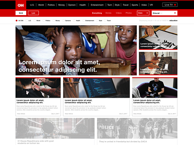
CNN Homepage
CNN Search Results:
CNN Search Results Page was UI design challenge I did for Thirtyui.com. Thirtyui.com is an online challenge website where you can enhance your skills with daily questions for 30 days.
Problem:
The problem this challenge was the client had a search results page and was not getting great results. They believe this is due to a poor layout and it was not easy to navigate.
After reviewing the layout, I saw that CNN search results page needed some improvements and several google's ads were popping up on the page. The Ads were drawing attention away from the main site, so removing them would provide better results.
Solution:
Looked at different competition website like USAToday. I narrowed down my ideas to figure what might work for the user and to have an easy time focusing on the main content on the search page.
I wrote my ideas and sketch a concept on paper. Then I started working on the design in Adobe XD. Narrowed down some my ideas to see what worked.
Some of my ideas were to bring a search voice command option. In displaying on the site I wanted to offer two views which feature “grid” and “list”. With having those options this would allow users to have more control over which layout is preferred.
Adobe XD Prototype:
https://goo.gl/4dBTei less
