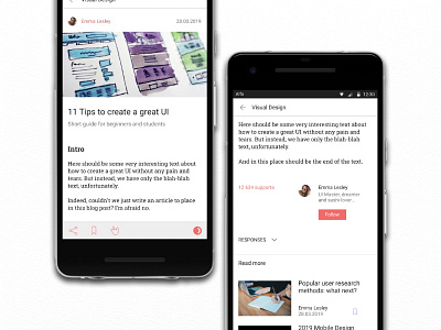
Blog Post (Daily UI #035)
Ascetic and light colours, night version are important in this UI, I believe. And of course the comment section is required for a blog, but in mobile, I think, it should be hidden in a dropdown.
Pics are taken by https://unsplash.com/photos/00JuluDEK5w, https://unsplash.com/photos/TC5P6ZRxDbI,https://unsplash.com/photos/tZc3vjPCk-Q, https://unsplash.com/photos/YGTw7VdAkUM.
More by Daria Samarina View profile
Like
