Website Design Animation for Neon Startup
Hey guys!
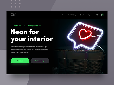
@Andrey has recently come up with a website design for a cool Neon startup: the guys offer a wide range of finished Neon products, and also give their clients an opportunity to customize the product and come up with some dazzling designs of their own. I decided to add some life into the design to give you a clearer picture of what the website homepage will look like.
The goal was to create such a website that would match the product’s rad nature and reflect the guys' individuality at the same time. To this end we used dark color palette with bright colors to put accents on the main page elements. We also applied neon light effect on the active ui elements with the same purpose of putting accents on them. In this way we created a linkage between the website design and Neon products that are also used as accents - the accents we add to refresh interior design.
Don't be shy and share your thoughts! ;)
Oh, and have a great Friday everyone!
Press "L" to show some love!
ᗈ Join our Newsletter!
ᗈ Website
ᗈ TheGrid
ᗈ Spotify
ᗈ Twitter
ᗈ Medium
ᗈ Facebook
ᗈ Instagram
