Branding & website design for A-mnemonics
A-mnemonics needed a new identity and website to showcase their growing portfolio. The brief was to create a site that was clean and fresh, that was able to stand out against their competitors.
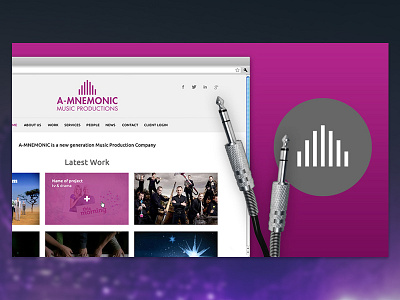
My research for the logo led us to exploring strong graphic wave patterns and playing with the letter ‘A’. The design for the logo alludes to sound bars often associated with music production, while also forming a triangular shape. The mark is simple and elegant and supported with bold typography.
Many music production sites use a strong black background. Working with the client, i decided to shy away from this to keep the site light and modern. The site is also fully responsive, which means it works on all devices.
----------
Interested in working with me?
Drop me an email at: bryan@styleswebbin.co.uk
