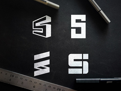
Steel Improvements - Logo Grid
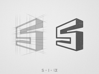

Thanks for your feedback on the previous post, this was the choosen option because it's the one that conveys more information on it. The S from Steel on the Left, the I from Improvements on the right (more subtle) and the overall shape of a bent Steel Beam 🏗
Now it's time to get on the type and colors to go along with it. Do you have any suggestions for the color?
--
📨 Got a project? Let's work together! Email: wisecrafted@gmail.com
--