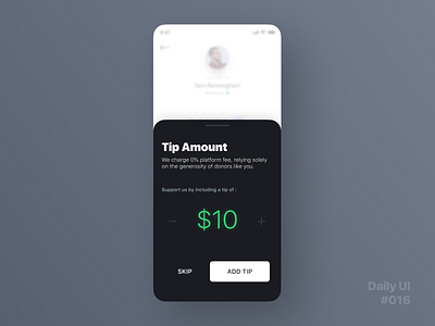
Daily UI Challenge #016 - Pop-Up / Overlay
Here's a simple overlay sheet for today's challenge. I find this element being a common sight in apps these days. Love its implementation since I feel its one of the best ways to keep the feeling of continuity going within an experience. It lets the user know that "Hey! Here's some new content to interact with" while at the same time since it doesn't cover the entire screen saying "Don't worry your previously engaged content is right where you left it." allowing the user to resume or dismiss this content if he pleases. It gives the user the feeling of control and power with the 'handle' like element at the top-center of the overlay card.
Designed in @Figma
Let me know what you think in the comments! 🤓
More by Keith Vaz View profile
Like
