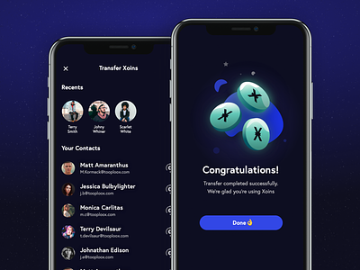
Xoin transfer screens
Hello Dribbblers,
This time I present you something new from my pet, side UI project. Contact Screen and Success screen. I wanted to keep it in playful, colourful vibe, but clearly communicate what happened to the user.
Should I animate it in a `Parallax` style? 🤔Maybe.
Should I post something bigger from this project? Surely.
Stay tuned and wait for a bigger piece next week!
We're ready for new design challenges!
Reach out to us via hello@tooploox.com 📨
--
Love it? press "L" ❤️ 😄
Check our Tooploox profile and click Follow! 🚀
More by Tooploox View profile
Like


