Product Design System
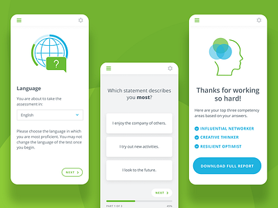
Continued visual exploration for a test-taking product.
One interesting challenge here is that the product can be white-labeled. With that in mind, the entire visual system is built around 2 swappable "brand colors" (shown here as green and blue, with opacity variations) and a set of neutrals. With the magic of Figma color styles, we can easily update the entire set of comps by changing those 2 colors.
More by Viget View profile
Like
