Socialite - Restaurant Identity Design
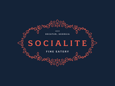
In this rejected direction for the identity for Socialite, a fine eatery that will be located inside an active adult community, we explore a modernized version of classic filigree and flourishes. This highly French, Art Nouveau inspired direction is a fresh take on classic aesthetics.
The flourishes use circles to depict social circles that are interconnected and intersecting. Those circles are supported by leaf-like elements that imply personal growth.
Socialite's typography is a classic display to root the overall look in the tenets of food service and all the expectations that come from that way of doing things.
More by Joseph Szala View profile
Like


