Law Firm Branding & Identity
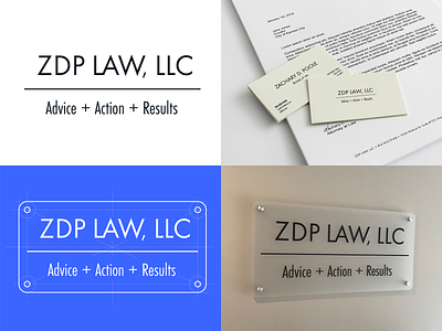
Branding and some collateral for a new Kansas City law firm: ZDP LAW, LLC. Creative brief summary was classic and formal, yet modern–which was befitting for a new law firm.
The main logotype is Futura PT Condensed with a custom "LW" ligature and some kerning attention to individual letters. I also knocked down the sizing on the comma, to keep it from getting too distracting.
The Advice, Action, Results tag line is Futura PT. We tried a bunch of different stuff for the separators: pipes, bullets, etc... We ended up really liking the plus signs, as they make some sense from a semantic viewpoint and add modern flair to what is otherwise an extremely formal logotype.
The color is Pantone Black 6C, a bluish black, keeping with the serious tone.
I art-directed the signage, which was created and installed by Image360 in Kansas City: https://www.image360.com/kansascitymidtownmo. They certainly weren't the cheapest in town, but the service was great and the end product turned out awesome.
We also created a smaller way-finding sign near the entrance of the building. I've attached a shot of that.
Law firm's website is: https://zdplaw.com


