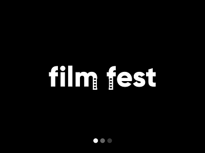
Film Fest Logo Design
I challenged myself to create a logo mark about one of my passions and describe the topic with type and with a visual representation simultaneously. I picked the space of film, more specifically film festivals because they often give smaller filmmakers the chance to showcase their hard work and possibly even win awards helping them create even bigger films that can make it on the "big screen".
For this logo I experimented with negative space by turning the stems of the “m” and “f” letters into film sprocket holes. This creates the rest of the film strip frame which appears in the center or negative space of the two words.
By keeping the contrast strong, the negative space effect stays punch and easy to identify with little effort.
More by Matt Nemetz View profile
Like
